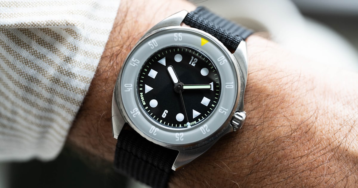

The dial is really where Paulin leans into its graphical roots, with the brass dial getting a matte treatment in black or dark blue and plenty of little designer details. The dial and bezel insert feature the brand’s own ‘Wim’ typeface, designed by Paulin and AnOrdain’s in-house typographer Imogen Ayres (who also happens to be Paulin’s Creative Director). This complements the boldly geometric hour markers, in shapes of triangles, squares, and circles, which offer a bit of ironic imperfection through hand-applied Super-LumiNova relief printing for underwater illumination.
Paulin’s logo and “Glasgow” are nicely integrated into the printed minutes track, while broad, rounded baton hands in two shades of Super-LumiNova provide maximum legibility. A lollipop seconds hand with a bright, contrasting colored tip is the cherry on top. I’m obsessed with this dial design, and I think that the balance achieved here between usability as a tool watch and visual interest is quite perfect. It’s a good reminder that good designers possess the all-important quality of restraint.